Motion chart is used to show the data using X-axes and Y-axes that display the change over time by showing the movement of the data points as well as variations in the color of the lines.
The motion chart has the advantage to view the trail of how the data has changed over time.
Motion chart needs only one Time Dimension and one Measure in tableau.
For example: consider the data source such as Sample-Superstore, and if you want to find the variation of Profits over the Months. For this, there are the following steps given below, such as.
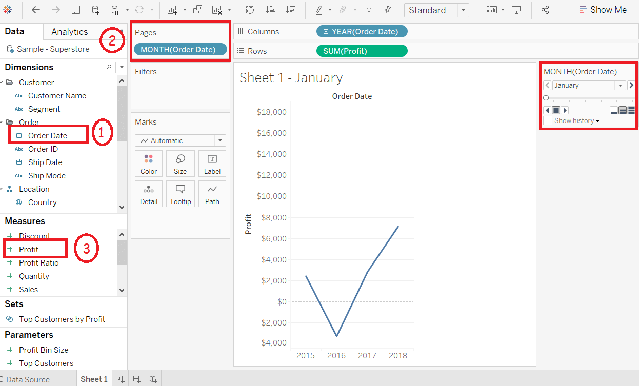
Step1: Drag the Dimension Order Date into the Columns Shelf.
Step2: Again, drag the dimension Order Date into the Pages Shelf.
Step3: Right-click on the Order Date field in the Pages shelf, and choose Month option.
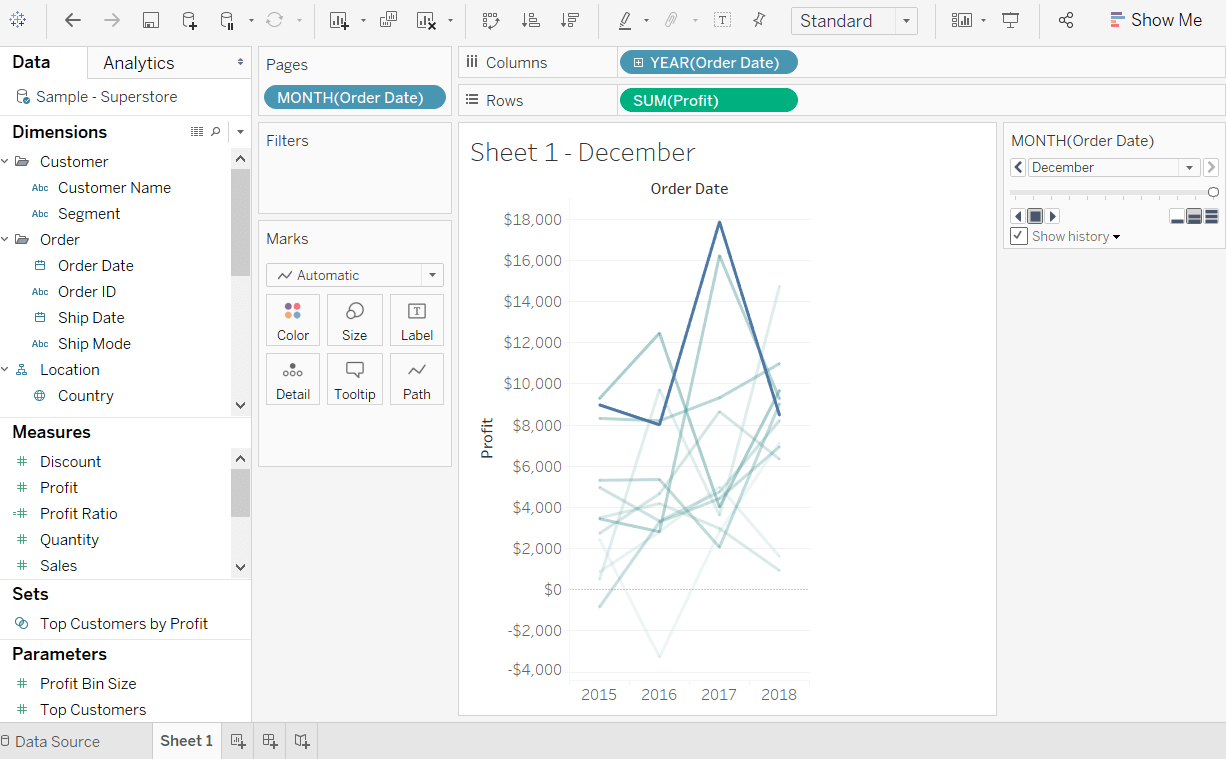
Step4: Then, drag the measure Profit to the Rows Shelf. And appear chart Shown in the below screenshot.
Step5: Put a checkmark in the box next to “Show History” button and then click on the dropdown arrow next to it.
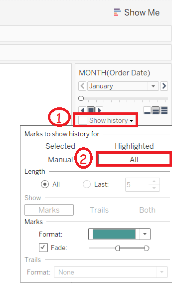
Step6: For “Marks to Show History For” option, select All. And under “Show” option, you can select Both, Marks option shows only the points and also selects Trails option shows only the line. Click the Pslay button and below chart appears.
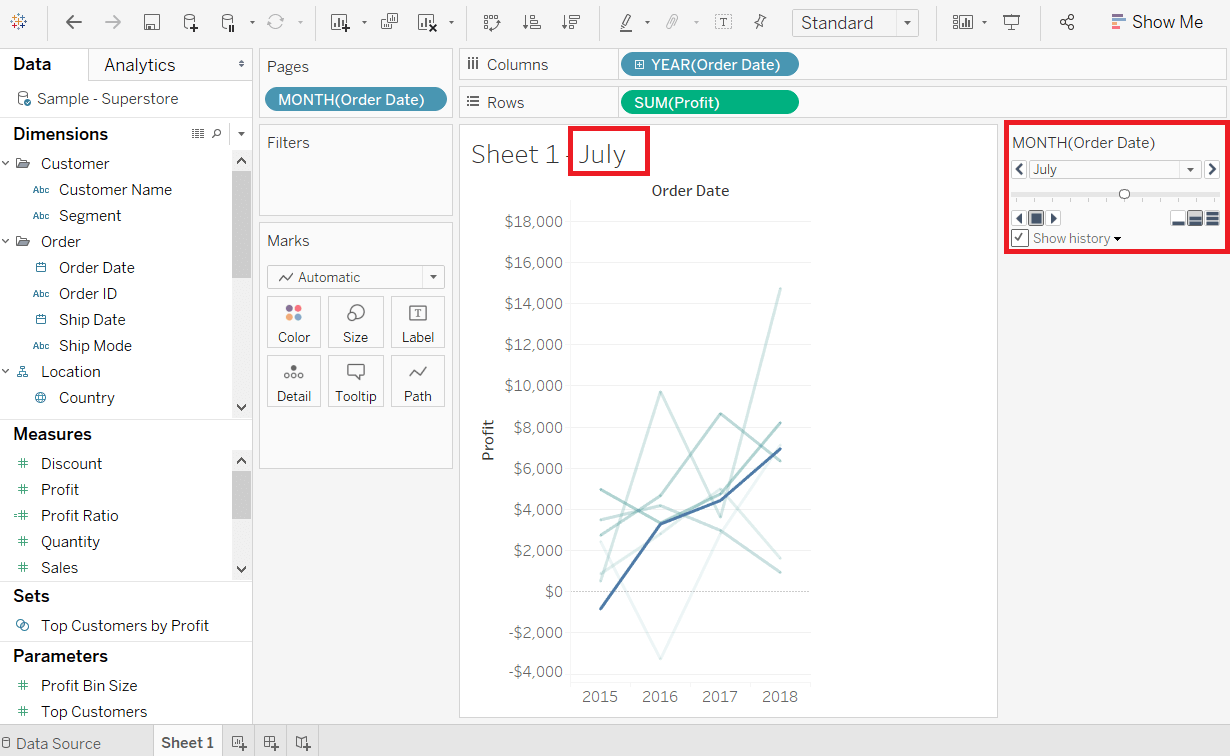
After allowing the chart to run from January to December, it creates a chart that shows how profits varied over each month in the whole year.
According to the appear chart, the data changes in the recent month get a dark shade of the color, and the historical data gets a light shade of the color. You can see in the below screenshot.